Muthu,

What drives me? Finding out the why behind the things that intrigue me.

Why live? To apply what I learn, tweak it and tinker with it until it makes an impact.

How, so far?

  • 3 years as a product manager in consumer apps. I built and launched an automatic photo-sharing app from 0 to 1, and worked on a social network in more than 10 languages, with more than 9 million monthly users at its peak.
  • Lately, I build products that use AI sensibly, like a platform where children work through a great idea the way it happened: how it evolved, its constraints, the concepts it used and the outcome.
  • Before product management, I spent 4 years as a product designer and 2 as an architect, designing and building physical spaces for people.

What I’ve been up to

Projects

Measure the Earth with Eratosthenesa question-and-answer game for children

Product lead
Sep 2026
desktop browser
for children aged 10 and above

The product

  • A browser game where children aged 10 and above work out how Eratosthenes measured the Earth, by answering his questions.
  • Play

The problem

  • Children learn great discoveries as facts: simplified, with the details left out.
  • They miss the leap behind the idea, and the details that had to be worked out.
  • I believe working through a discovery would change how children see the world and the problems in it.
  • So I built a way for them to work through one discovery themselves.

My role

  • Defined the core:

    • a Socratic, question-and-answer chat
    • the stages of the problem for four age groups, with their props and hints
    • hand-written exchanges for every stage
  • Refined it with the agents, playtesting as we built.

  • Directed the build with two agents that shared one changelog:

    • a design agent: UI and UX, copy, dialogue, props, animation, simulated test sessions
    • a coding agent: the game, the server, the tests and the simulated test runs
  • Had the code audited against the design.

The key decisionwrite every reply by hand

  • The aim: the game is a starting point, not a course. It builds the intuition to connect what a child already knows to a problem that seems unrelated.

  • The issue: a language model writing replies from a script revealed answers and invented questions.

  • The decision: given the narrow scope, I wrote every reply by hand.

    • Code settles clear answers ("shadow", "50").
    • A small model (Claude Haiku) judges the rest against 11 fixed verdicts.
    • Two low-cost models screen messages for prompt injection and off-topic requests.
  • Quality first: quality set the design. Cost stayed low because a model is called only where code can't decide.

  • The trade-off: replies vary less, with only minor variations.

What shipped
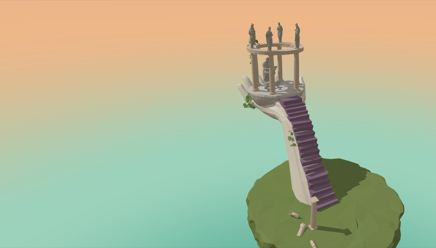
1 image
The island: a low-poly floating island where a stone hand holds a round pavilion with Eratosthenes' statue, reached by a purple staircase. The chat opens over it when the child taps the light beside the statue.
  • A 3D world with a chat, and stages set by the child's age.

  • Interactive props let children test shapes and angles and see what changes.

  • Hints that get more direct. Each wrong guess brings a more direct hint. The last is too obvious to miss. If it is missed anyway, Eratosthenes gives the answer and moves on.

  • Recorded conversations. Every conversation is recorded for review, to improve the game.

What I'd do next

  • Test with children. No child has used it yet; it has been tested only with simulated users. Next is a classroom playtest.

  • Add parental consent before storing emails or chats (India's DPDP Act).

  • Test on Safari and on phones.

  • Move to a paid Groq plan before traffic passes the free tier's 30 requests a minute.
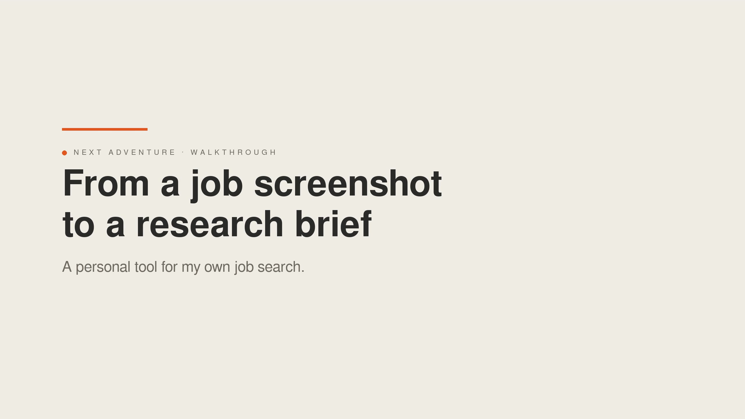
Next Adventurea pipeline for my own job search

Product owner and builder
Sep 2026
n8n workflows, plus a web app built by a coding agent
a personal tool, private: it holds my applications.

The problem

  • LinkedIn is good for finding jobs and gives a basic fit check, but it isn't enough.
  • Looking for product roles from Bengaluru, open to anywhere, meant reading dozens of listings a week to find the few I'm aligned with.
  • Most fall short somewhere:
    • the role isn't relevant
    • I'm not the right fit for it
    • I don't share the company's purpose
    • the cost of living is too high for the salary
  • The few that pass need a couple of hours of research before I decide to pursue them.
  • So I wanted a workflow that does the filtering and research for me, so that my hours go only where they're valuable.

My role

  • Defined the stages of the job hunt. Each stage decides one thing, by a rule of its own.

  • Built them as n8n workflows:

    • Three ways in: LinkedIn alert emails, a screenshot of any listing I come across, and a daily automatic search.
    • The stages: a relevance check, fit analysis, company research, and a brief that combines the job, the fit and the research.
    • A cover-letter chat that works from my CV and matches the tone of letters I wrote by hand.
  • Had the web app built: I wrote the requirements and had a coding agent (Claude Code) build it in 14 phases, with checks against my live job sheet along the way.

The key decisionrun the cheapest checks first

  • Why a workflow: an AI assistant, in a chat, could have done most of this. Two things made it a workflow: LinkedIn alerts arrive automatically and should be processed without me, and I wanted to explore a no-code tool (n8n).

  • Cheapest checks first, so the costlier ones only see the jobs that pass:

    • Before any model judges a job, keyword filters drop irrelevant postings, and a duplicate check drops any job already on my list.
    • A small model (Claude Haiku) checks relevance against my experience: my design years count toward total industry experience, not toward PM experience.
    • Only relevant jobs reach a larger model (Claude Sonnet). It looks up salary and cost of living where the job is and estimates what I'd save in a year. That number answers whether a move is financially viable.
    • Company research, the costliest step, runs only past a 75% fit gate, and once per company. It is reused for every job there.
  • I decide at each step that matters: a held job waits for my approval, a cover letter is written only when I ask for one, and a rejection-feedback email is drafted, never sent.

What I built

1 video, 1 image
2:12
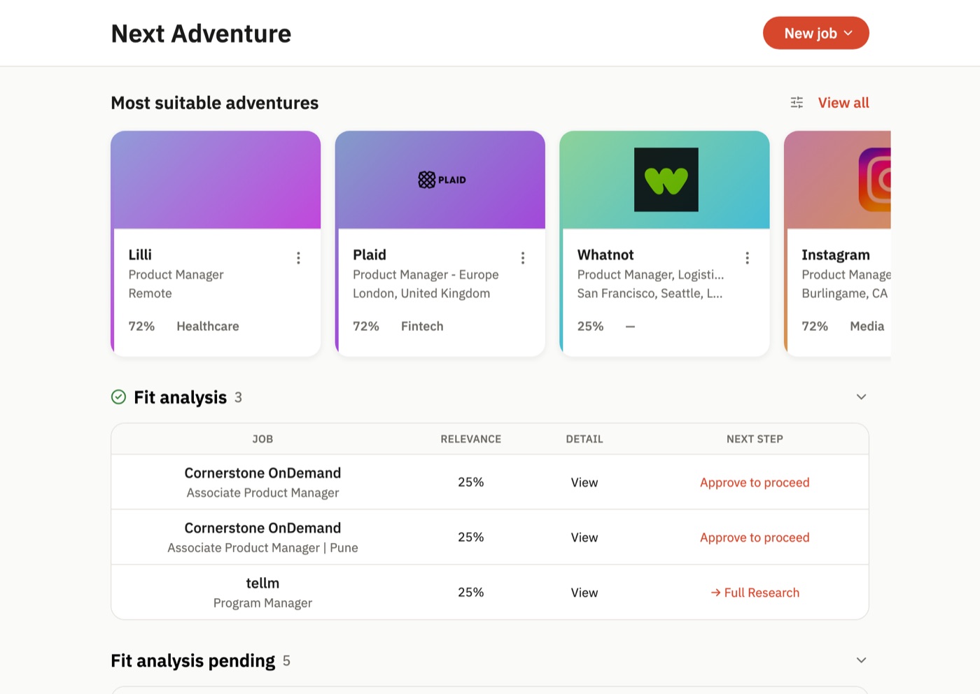
Walkthrough. From a job screenshot to a research brief, in six steps.
The queue: the strongest jobs lead the page as cards; the rest wait in sections for the step they need next.
  • A web app with the strongest matches on top.

  • From match to application: I review a job, move it to the cover letter, and mark it as applied.

  • Replies: the inbox reader follows each applied job. A reply moves the job to interview or rejected. A rejection that invites questions gets a feedback email drafted for me to review.

  • Jobs waiting for me: jobs that stopped at an earlier step wait in their own sections. One tap moves any of them forward.

The result

  • For scale: of the 12 jobs the pipeline has screened, 5 weren't relevant, 3 stopped at the fit gate, and 4 reached a brief.

  • Company research: 30–40 minutes instead of a couple of hours, depending on the domain and how well I know it.

  • Choosing between jobs: simpler, because the facts I compare are in one brief per job.

  • Skimming irrelevant listings: close to zero time.

  • Tracking: I can see each job's stage and decide its next step.

What I'd do next

  • Calibrate the fit score with a rubric and worked examples.

    • Scores cluster at 25% and 72%, so no job has cleared the 75% gate on its own.
    • The gate held the poor matches, but I released every good one by hand.
  • Improve how job descriptions are scraped: half the jobs gathered have no full description to judge.

Work

PicSeetaking a photo-sharing app from 0 to 1

Founding PM, reported to the CEO · team of 7 · Jul 2024 – Jul 2026 · iOS and Android · launched to 500–600 users, grew to 10,000; the company wound down in July 2026.

Founding PM, reported to the CEO
team of 7
Jul 2024 – Jul 2026
iOS and Android
launched to 500–600 users, grew to 10,000; the company wound down in July 2026.

The problem

  • Friends take photos of each other at trips and events, then the photos sit in one person's gallery.
  • Sharing means picking, sending and asking, so most never get shared.
  • PicSee found the friends in each photo with face detection on the phone and sent the photos to them automatically.

My role

  • Defined the vision with the CEO and scoped the MVP.
  • Refined the designs into complete flows, within his design direction.
  • Set up launch metrics with the data analyst.
  • Used post-launch data to decide what to change and build next.

The team of 7 owned engineering and the ML pipeline, which ran on a custom-trained model. A growth lead ran marketing, all of it organic.

The key decisionsend photos automatically and process them only on the phone

  • Hypothesis: sharing should be the default, not a task, and photos should stay off the cloud, unlike other photo services.

  • How it worked: once the app found the friends in a photo, it notified the sender and sent the photo 24 hours later, or sooner if the sender chose.

  • Safeguards, because photos went out without a tap:

    • the 24-hour notice
    • sending only to connected friends
    • Recall, to take back any photo at any time

The launch date was fixed. To meet it, we made three decisions:

  • Privacy with speed. Face embeddings were extracted on the phone, so photos never left it. That was hard to make fast, so we dropped support for some budget phones, chosen by market share.

  • Parked: children under 14. The model was weaker on children's faces, and good training data wasn't available.

  • Organic growth, no paid ads. A lesson the CEO, the growth lead and I brought from Koo.

Scoped with user research and beta feedback, the MVP cut 2 months from the time to market and launched on schedule.

What shipped

4 videos
2:09
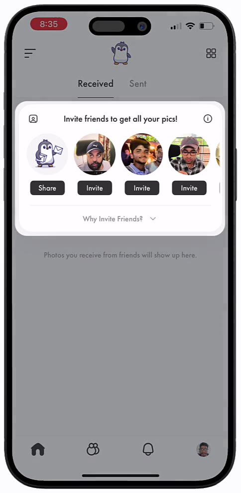
Onboarding. How the app works, the privacy controls, sign-in, face capture for login, and finding friends in photos on the phone.
1:01
Inviting a friend. The app suggests friends it found in your photos, and the invite tells them their photos are waiting.
0:23
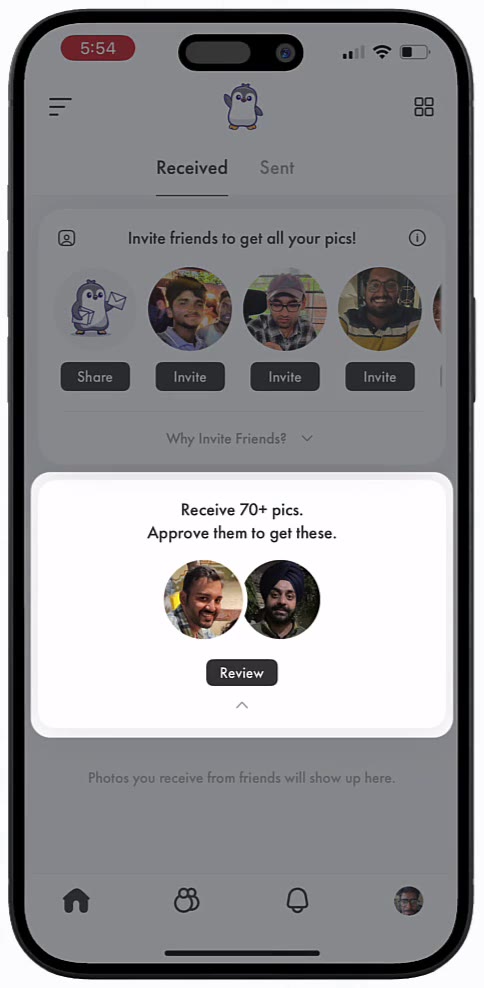
Approving a friend. Photos are exchanged only after both people approve each other.
0:39
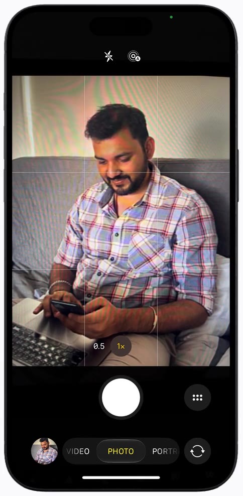
Capturing and sending a photo. A new photo is matched to a friend. The sender gets a 24-hour notice and can review, remove or send the photos now.

The result

Each post-launch change moved the metric it targeted. The one the business depended on, the viral loop, improved but stayed below 1.

PicSee results after launch
Metric Scale Before → after
Viral loop (new users per user) 0.4–0.5 to 0.6
Invites per user 2 to 4
Onboarding completion 55% to 70%
Photo-to-notification time hours to under 10 minfor 80% of users
Connected friends per user 2 to 4
14-day retention 50% to 62%

By July 2026, the app had scanned 2.5 million photos with faces. All of the scanning ran on users' phones.

What didn't work

  • The plan. Photo exchange was meant to be the first step toward a private network for close friends and family to share everyday moments.

  • No repeat use. That needed people to come back, and they didn't: the app was a vitamin, not a painkiller. People saw a photo once, then left.

  • Growth fell short. The viral loop stayed below 1. A free tool for event photographers added a new channel, but it did not bring in as many new users as we expected.

  • Delivery speed. Phone limits on background processing were also a constraint: we brought photo-to-notification time down to a few minutes on most phones, but near-instant delivery couldn't be guaranteed.

  • The outcome. The app reached 10,000 users, but the network never formed, so the company chose to wind down in July 2026 while it still had ample funds.

What I'd do differently

  • Ask how people try to solve it today. Everyone recognised the problem, but few were looking for a fix. We should have treated that gap as a warning.

  • Read the beta for repeat use, not first reactions. Our closed beta testers loved seeing photos of themselves they had never seen. That reaction came from novelty: once they had seen those photos, they had little reason to open the app again. We saw this only a few weeks after launch. I'd run the beta over several cycles and check the viral loop and return visits before launch.

  • Pick problems people already spend effort on, or where the product is 10 times better than what they do today.

Koohelping new users find creators worth following

Product Designer, then Associate Product Manager from May 2023 · Mar 2021 – Jun 2024 · iOS and Android · Indian microblogging app in more than 10 languages · peak of more than 9 million monthly active users; shut down in July 2024.

Product Designer, then Associate Product Manager from May 2023
Mar 2021 – Jun 2024
iOS and Android
Indian microblogging app in more than 10 languages
peak of more than 9 million monthly active users; shut down in July 2024.

The product

  • Launched in 2020 as an Indian alternative to Twitter, for people who wanted to post in their own language.
  • Reached about 60 million downloads.
  • Shut down in July 2024, after acquisition talks failed.

The problem

  • New users chose a language during onboarding. This told us which creators to suggest, but the list was still too wide.
  • People had to scroll a lot to find relevant content.
  • Only 25% of new users followed anyone in their first session.
  • Without follows, their feed had little that mattered to them.

My role

I worked on this problem first as a designer, then as a PM.

  • As a designer:

    • Added interest selection to onboarding, so that we could suggest creators and topics that matched what each person cared about.
    • Also designed Koo Rewards, multi-language posting and the design system.
  • As a PM: led Bulk Follow, the Topics widget and the News widget from discovery to launch, with engineering, design and leadership.

The key decisionshow fewer suggestions at a time

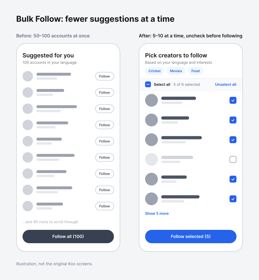
  • Before: Bulk Follow showed new users 50 to 100 accounts at once, and going through them was tiring.

  • Proposal: show 5 to 10 at a time, with an option to uncheck accounts before following.

  • The team's concern: follows drive retention and engagement, and fewer suggestions could mean fewer follows.

  • Test: an A/B test with different batch sizes. Batches of 5 to 10 worked better than 10 to 15 or more.

  • Result: accounts followed in the first week went from 3 to 5, and monthly retention improved by about 10%.

Also: Topics in the main feed

  • Topics had been a separate page behind a banner.
  • I added a compact version in the feed, where people could follow a few topics, with a link to the full page.

What shipped

2 images
Bulk Follow before and after: 50 to 100 accounts at once, then 5 to 10 at a time with an option to uncheck. Illustration, not the original Koo screens.
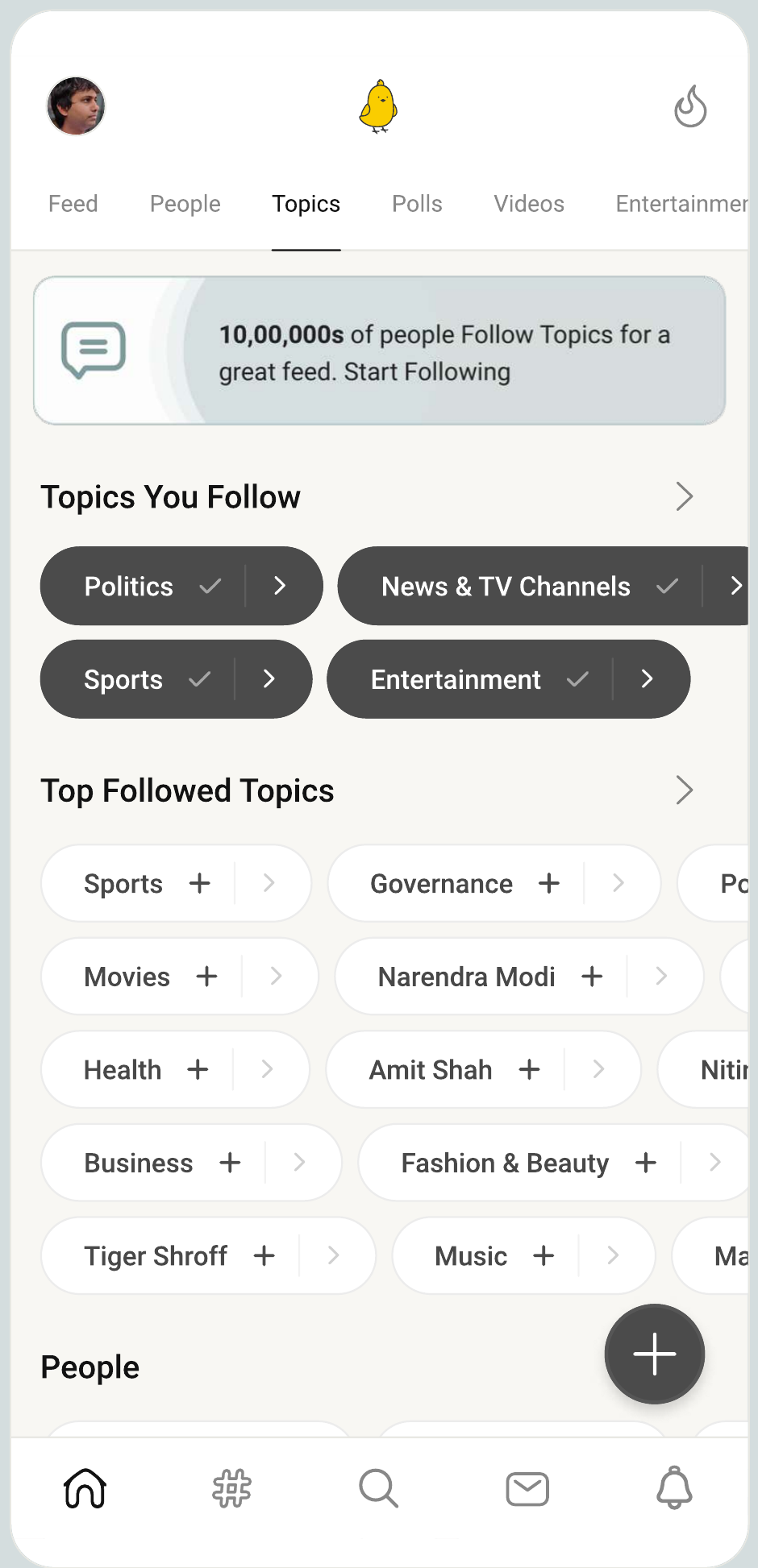
The full Topics page that the in-feed Topics widget linked to: topics you follow, and the most-followed topics with a follow button. Koo screen, as designed.

The result

Koo results
Metric Scale Before → after
New users following at least one account in their first session Change: Interest selection in onboarding (as designer) 25% to 35%
Accounts followed per user in the first week Change: Bulk Follow, A/B test 3 to 5
Monthly retention Change: Bulk Follow, A/B test About+10%
Average session length Change: News widget, A/B test 4:00 to 4:50
Overall engagement (combined score) Change: Topics widget in the feed +4%

What didn't workKoo Rewards

How it worked

  • Koo Rewards paid users in Koo coins, which they could exchange for cash.
  • Users earned coins for spending a set number of minutes in the app, taking a set number of actions and opening the app every day.
  • I designed it as part of the team.

What happened

  • People did these things for the reward, not because the app was useful to them.
  • When the rewards stopped, they left, and the programme had cost a lot of money.
  • Paid growth had the same problem at company level: in its 2022 financial year, Koo spent about $16.5 million on advertising and earned about $650,000 in revenue.
  • From this, I learned to pay for growth only when customer lifetime value (CLV) is above acquisition cost (CAC), a lesson I took to PicSee.

Koo struggled for two linked reasons:

  1. The content was not diverse enough, which kept engagement low.

    • Few top-tier creators. There was less popular content to draw people in.
    • A political image. Koo was promoted during the government's Aatmanirbhar (self-reliant India) campaign, so many people saw it as linked to the ruling party and stayed away.
    • Limited reach by language. A post in one language reached only people who read that language, so creators had little reason to move from Twitter.
    • With less varied content and fewer strong creators, helping new users find people to follow was harder.
  2. It ran out of time. It had to focus on earning money before its network was stable.

What I'd do differently

  • Build growth into the product. Design a viral loop first. Use paid growth only when there is no loop and CLV is above CAC.

  • Reward value, not activity. Actions taken only for a reward stop when the reward stops. Test incentives against a holdout group and check retention after the reward ends.

  • Give fewer, clearer choices. The fewer and simpler the decisions a user must make, the better for them. In Bulk Follow, smaller batches led to more follows.

Strakinanswering buyers’ questions at checkout

Product Designer · Strakin, a service company in Bengaluru · Jan 2019 – Feb 2021 · Two projects: Exchange Data International (financial data APIs, web) and Glukoin (Strakin's own health records app, in beta on iOS, Android and web).

Product Designer
Strakin, a service company in Bengaluru
Jan 2019 – Feb 2021
Two projects: Exchange Data International (financial data APIs, web) and Glukoin (Strakin's own health records app, in beta on iOS, Android and web).

The product

  • Exchange Data International (EDI) is a London financial data company, founded in 1994.
  • It sells financial data through APIs as subscriptions, to hedge funds, asset managers, banks and software companies.
  • Buyers could start a trial and subscribe through a checkout on EDI's website.

The problem

  • Only 35% of people who reached checkout completed it.
  • Many asked questions on EDI's support channel instead of buying.

How we found out

  • We grouped the support enquiries by reason.
  • EDI's team wanted to speak to buyers themselves, so we gave them our questions, and they called people who had enquired but not bought.

The calls and enquiries showed that the checkout page did not answer the questions buyers had when they were about to pay:

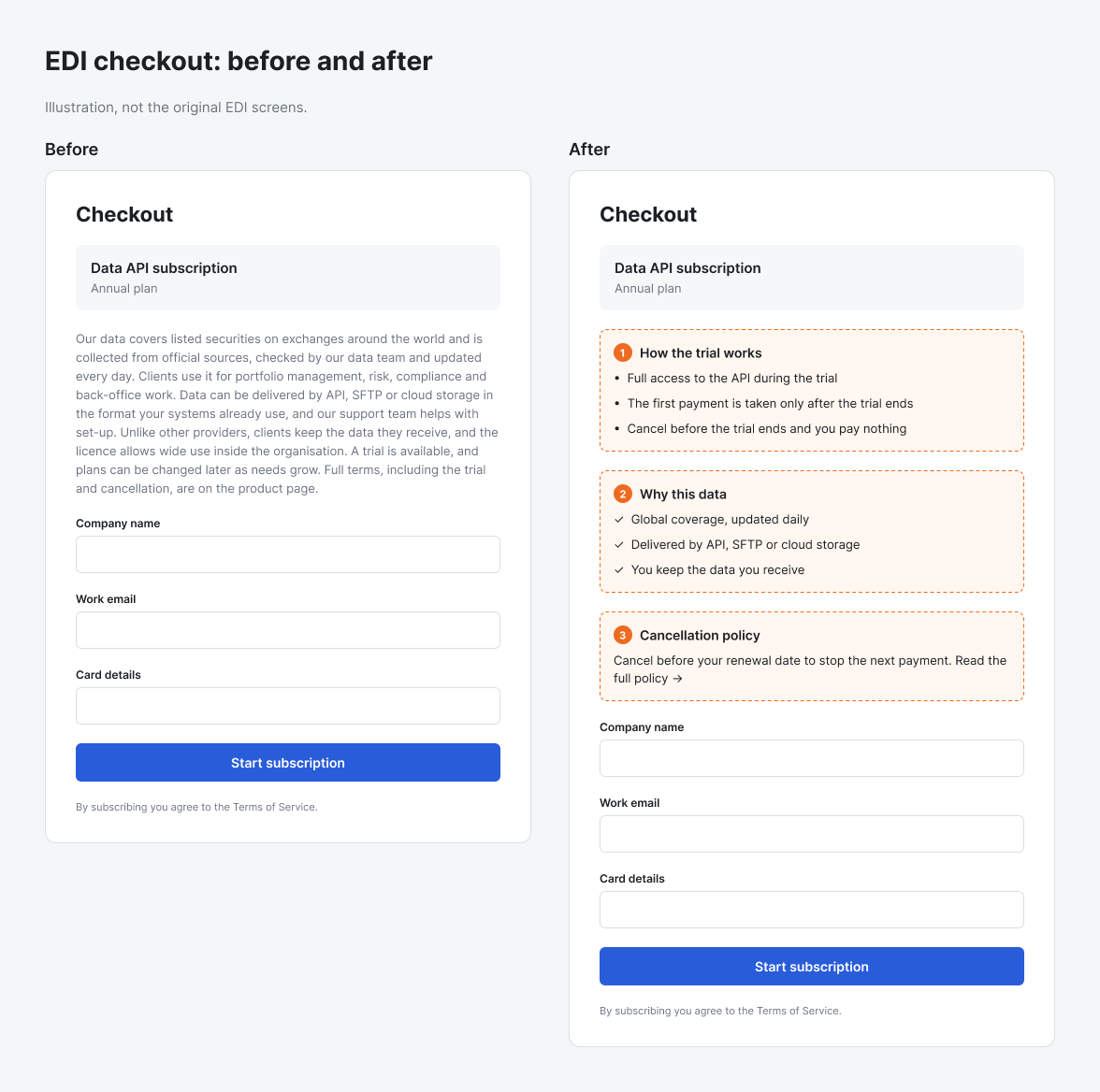
  • How the trial worked. There was no summary of the trial period.

  • Why EDI. The key benefits and differentiators were in one long page.
  • How to cancel. The cancellation policy was only on the product detail page.

My role

  • EDI was a Strakin client. My senior was EDI's point of contact.
  • I worked with him on design and analysis:
    • grouped the enquiries
    • wrote the questions for the calls
    • analysed the answers
    • redesigned the landing page, product pages and checkout

The key decisionanswer the questions on the checkout page

The details existed, but on the product detail page, away from the point of payment. We put them on the checkout page itself:

  • A short summary of how the trial period works.
  • The key benefits and differentiators as a few short points, not a long page.
  • The cancellation policy, visible at checkout.

What shipped

1 image
EDI checkout before and after, with the three changes marked. Illustration, not the original EDI screens.

The result

Strakin EDI checkout result
Metric Scale Before → after
Checkout conversion How measured: A/B test 35% to 48%

Glukoin, in brief

  • Strakin's own app for people with long-term conditions such as diabetes.
  • It kept their health records in one place: users added their reports and readings by hand, tracked them over time and got reminders for medicines and tests.
  • Labs could also send reports directly through the app. All data was encrypted in the cloud.
  • The product was already in testing when I joined. I designed the profile, report upload and report viewing flows.

Glukoin stayed in beta and did not find product-market fit:

  • Too much work for older users. Most users were older people. Adding reports by hand, with little automation, felt like work, and the app was hard for them to use.

  • The need was real but not urgent. People already kept paper copies of their reports.

  • Labs had no reason to join. Sending reports through the app was extra work that did not fit their workflow, and many labs already used apps such as Practo, or their own flows, that did the same job. Glukoin was not a clear improvement for them. People also went to different labs at different times, so many labs had to join before a person's records were complete.

What I learned

  • Support enquiries show where buyers get stuck. Grouping them by reason pointed to the problem faster than the conversion number alone.

  • Answer questions where the decision is made. Details on another page do not help a buyer at checkout.

  • Count the work a product adds. Glukoin asked users to enter reports by hand and asked labs to change how they worked, and gave neither enough back.

Architecturewhere it all started

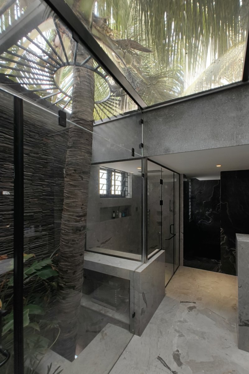
Before product, I spent two years as a design architect at Murali Architects in Chennai. One project, Harshana Residence, was a house of about 10,000 sq. ft on an 8,000 sq. ft plot covered with coconut trees. We wanted to keep every tree and design the house around them. The client felt some trees could stay, but not all. I showed them a design that kept every tree, then worked with the structural and plumbing consultants on the details to protect both the house and the trees. One tree grew inside a bathroom. The house was built that way and became one of the firm's most successful projects. This is where I learned to show people a clear picture of what could be built, then work out the details with every stakeholder to find what is possible and make it work.

2 images
Harshana Residence: the coconut tree that grows through the bathroom, with an opening in the roof around its trunk.
Harshana Residence: the living room, with the retained coconut trees outside the double-height windows.

Contact

Write to me

Books

Like an explosive awaiting a spark, unimaginably numerous environments in the universe are waiting out there, for aeons on end, doing nothing at all or blindly generating evidence and storing it up or pouring it out into space. Almost any of them would, if the right knowledge ever reached it, instantly and irrevocably burst into a radically different type of physical activity: intense knowledge-creation, displaying all the various kinds of complexity, universality and reach that are inherent in the laws of nature, and transforming that environment from what is typical today into what could become typical in the future. If we want to, we could be that spark.

― David Deutsch, The Beginning of Infinity: Explanations That Transform the World